I had been following the Jerwood instagram and facebook feed, and just by chance I happened to be in Hastings on the first day of the show opening. I hadn’t appreciated it would be from only the Jerwood and Ingram collections, and as such I didn’t expect what I found. There were a few pieces I had seen before, some at the Jerwood but not only there. The works were not displayed chronologically, and this definitely allowed the thematic curation to excel. Naturally, there were some pieces that didn’t speak to me, but I appreciated the fact that by walking around with my father, husband and daughter it allowed me to stop and look at some I would have otherwise walked past quicker; we all found a good selection we liked.
As the works tend to be less well known it has been hard to source images to illustrate the ones we liked, and some are of a poor quality, but hopefully there will be new pieces for you to discover.
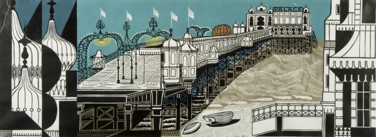
BRIGHTON PIER, EDWARD BAWDEN
Large scale lino cut that illustrates the pier in a very stylised manner.

HOUSES IN A VALLEY, CHARLES GINNER
An exquisitely detailed painting with a muted pallet.
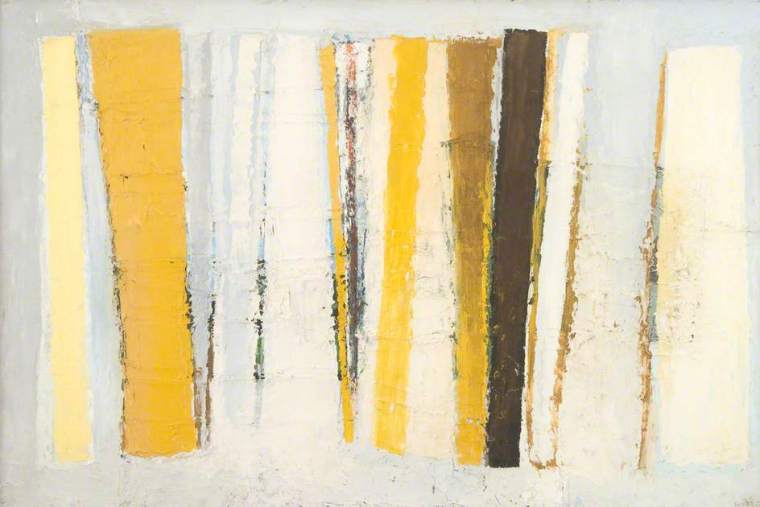
CHROME AND YELLOW, PAUL FELLER
One of my all time favourites, seen at the Jerwood previously and instantly warmed to. I do have a tendency to be drawn to yellow things, but also as a designer maker and not a painter I always find it fascinating when work is more abstract as I simply struggle with being able to create this layered effect.
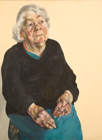
FRANCES ROSE, MAGGI HAMBLING
Maggi Hamblings’ work is always intriguing and I can spend such a long time just absorbing all the details and colours. The hands on this work are so true and honest and had me totally enthralled.

COPHETUA AND THE BEGGARMAID, JOHN ARMSTRONG
This image really doesn’t do the painting any justice; it has such fine detail, and the colours are much more vibrant. It was one of the pieces I had walked past but my daughter brought me back to look at it and not 2 minutes after discussing the details with her I had a similar conversation with my father. These conversations made me appreciate the work in a new light.

THE CANAL BRIDGE, LOWRY
Another piece I have always liked. My dad loves Lowry and so it is hard to not love something too that you have grown up with. A few years ago there was a great exhibition at the Tate of Lowry’s work, which made me appreciate his work under my own merit. Where possible I always draw from an exhibition and I clearly remember spending almost an hour just doing a pencil sketch of one of his large landscapes, and seeing so much more detail in it as a result.
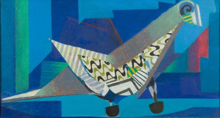
PIGEON POST, EILEEN AGAR
This work instantly hit me due to the colour hues and vibrance. It genuinely made me smile, and I wouldn’t say I’m particularly fond of pigeons! Gorgeous colours, and the style of it is definitely so appealing to me.

BOAT RACE, PAUL TREVELYAN
I do like Trevelyans work in the main, but of the two on display it was only this one I liked. Initially I didn’t clock the title but was more drawn in by the palette and composition than anything else.

POEM FOR A JUG, WILLIAM SCOTT
Finally, one that divided opinion between myself and my daughter. As a ceramicist I am a instantly drawn to anything that could be made in three dimensional form, and the simplicity of this, of the title and its understated meaning just reinforced how much I appreciated this. My daughter however, strongly disagreed.
